Design Before Motion
Collab 09 | October 2025
Because 2025 has been a . . . some kind of a year for client work, I decided on a whim to take a slot in the next round of Design Before Motion (09). A few people dropped out do to scheduling conflicts and so I swooped in. I thought it would be like announcing I was going on vacation, and then the client work just appear out of nowhere. (Spoiler alert: it did not.) But I was itching for a particular kind of challenge, and particular kind of challenge is what I got in spite of this not being my first rodeo with DBM.
To recap: Marc Lawrence has been facilitating the Design Before Motion Collaboration for 9 rounds now. He pairs a motion designer with a sound designer and they're given a piece of mid century modern artwork– an advertisement, a book cover, poster, etc.
The task at hand is to animate the still image, being as faithful to the original as possible. The video then gets handed off to the sound designer who will work their own unique magic to create a truly new interpretation.
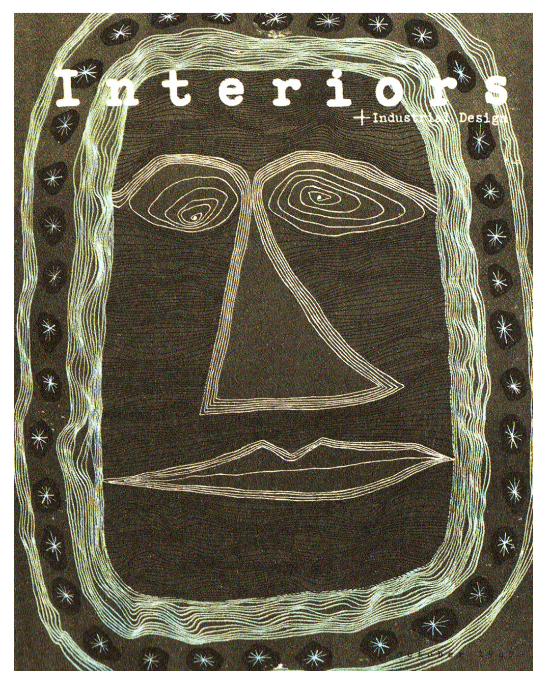
The original image that I was randomly assigned:
Paul Peter Piech's Interiors cover, 1949
Because I have nothing but the best of luck in all circumstances, this was the image that I least wanted.
I knew the line work would present a significant challenge, the colors are not my favorite, and I was really at a loss for how to build a narrative around it. I couldn't even see how I would break the design apart into workable pieces. Everything would have to be rebuilt from scratch instead of in a Photoshop session.
I decided to deep dive the work of Paul Peter Piech and found that his other work really appealed to me. It's so graphic and bold with a great mixture of super heavy line peppered with thin detailed line. I resolved that the best solution for me would be to push the image as far away from the original as I could. To lean more into Piech's other work with the heavy, solid line. Let's play around with a 60 pt, 30 point and 6 pt brushes in Animate and distill the face into flat, heavy line. We went the thick Sharpie route, which Animate is pretty ideal for. We're going to spend very little time in After Effects with this one.
A face in the void of the night sky was where I landed with narrative. Start with some stars in a dark, empty sky and have the face swoop in. It's less an actual person and more the idea of a nebulous figure, one with the ether. The face would look around, aware of its presence, and then the title of the magazine would pop up in syllables, Sesame Street style. (My animation inspiration was the Cartoon Modern style and Sesame Street.)
Then because I love to make my life complicated and difficult, I decided to throw in a lip sync. Because what do you do if you're a face in a night sky void other than either announce the name of the magazine in a booming voice or a quiet whisper?
This is where we landed after the animation was completed and I spent my afternoon in After Effects with textures, noise, and repeaters. The first pass has all the FX, the second has the final textures. At this point I handed it off to my sound design partner, Sam Taylor.
The final video with audio from Sam Taylor. I don't know how he made my terrible scratch track voice over recorded with QuickTime to sound a million times better, but such is the magic of a sound designer.
And here is the final compilation of all videos in the October 2025 round of Design Before Motion. There were some real head scratchers in this round. Cheers to a very creative group of designers.