Design Before Motion
Collab 07 | February 2025
Marc Lawrence has been facilitating the Design Before Motion Collaboration for 7 rounds now. He pairs a motion designer with a sound designer and they're given a piece of mid century modern artwork– an advertisement, a book cover, poster, etc.
The task at hand is to animate the still image, being as faithful to the original as possible. The video then gets handed off to the sound designer who will work their own unique magic to create a truly new interpretation.
After watching on the sidelines for a few rounds, I got enough FOMO to tell Marc that I was interested in participating. I was originally slated for a collaboration scheduled for April and that was far enough in the future that I could essentially ignore it and any potential conflicts that might emerge. Then a slot opened up for February and even though I had 3 jobs on the books, I said yes.
With how my jobs all experienced various levels of delay, I was left with a week to fully devote to my piece before my schedule got packed. I worked up a detailed task list in Notion and set to work.
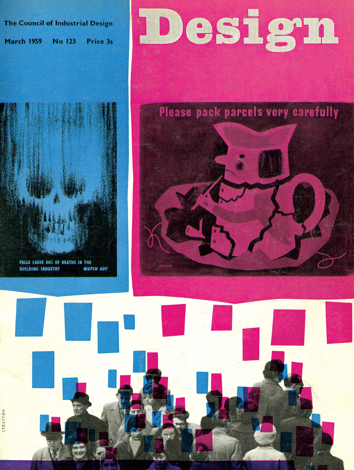
The original image that I was assigned:
Sheila Stratton's Design cover, 1959
This image intimidated the crap out of me.
When the images were announced, but hadn't yet been assigned, I had catalogued this one under the header of:
I would be so stressed out to get this.
Which meant that this image and I were fated to be joined together.
First steps were getting some storyboards worked out. I roughed it all out in Animate so I could test ideas as I went. I knew that I wanted the main piece to be the broken pitcher. I thought, it would be reasonable enough to cut up the pitcher into its various pieces, fit them back to together and have them break. From there it turned into, let's unpack it and then have it break. Creating a trail of the magenta blocks from the bottom of the screen up to the pitcher felt right, and they had to be staccato.
We can ignore just about everything else and fill the screen with those pieces. I've been on a big UPA kick for months and approached it from a question of how they would have handled this piece.
The biggest unknown was how to transition from the pitcher to the skull, as the figures felt like tertiary elements from the jump. I knew I wanted to animate something with the skull, but the image itself really threw me out of my comfort zone. I thought, we'll have a skull push in and fill the screen, real ominous vibes and then have the skull morph into the distorted image from the cover. In my head I kept thinking something like blowing on sand. Figuring out how to do it would come later. At about this time it started to dawn on me how dark this cover is.
Then we pull out, landing on the final lock up, the figures move into frame as the blue blocks populate down from the skull and the text comes on screen. There was a 10 second limit and this plan got me to 10 seconds.
I animated a lot and then scrapped most of it. Keeping it staccato meant I had to fight every urge I had to fall into my usual style of animating. But when I had things moving in smooth keyframes, it looked all wrong. Treat this like paper cut outs was a near constant reminder. It's harder for me to animate the way I want to in After Effects than it is in Animate. In Animate I can draw frame by frame and work on 2s without worrying about too smooth interpolation. After Effects needs hold keys for that and it's awkward. It came down to a lot of layers appearing and disappearing without any animation and then hold keys cutting between position and scale for camera moves.
Sourcing the textures was a process. PQ Art Parts and PQ Grit Kit, from Peter Quinn, did a lot of heavy lifting. I can't recommend that resource enough. I really need to make use of them way more than I currently do. My approach to sourcing textures and fonts was what can get me close enough? I wasn't going to perfectly recreate any of them from scratch, especially in such a quick turn around and with minimal resources. But if I got close enough to the feel of the original, that was good enough for me. I guess you could say that I prioritized recreating the feel versus the details.
Which brings us to where we finally landed.
I handed my video off to Brandon Habowski, a veteran of the Design Before Motion collabs. I felt very at ease knowing that my partner had been to this rodeo before. Audio is so far outside of my wheelhouse that I don't know how to direct it. I didn't even know what I wanted. It just wasn't part of my process.
He played on the staccato pacing of the animation and didn't overdo it, which I love. It's intentional and there's nothing extraneous. When he first showed me I said maybe it needed something like an industrial hum in the background for the duration, but I'm glad that he kept it simple. The more I lingered with that the more it felt unnecessary.
Everything is editing. From the start this piece was a process of removing elements and fluff. And it landed in that sweet spot. No more FOMO. We crushed it.