An animated alphabet created as part of #36daysoftype.
I wanted to use the least number of pieces and make the most of repeating shapes and animations. Each letter was limited to a length of 2 seconds to maintain cohesion.
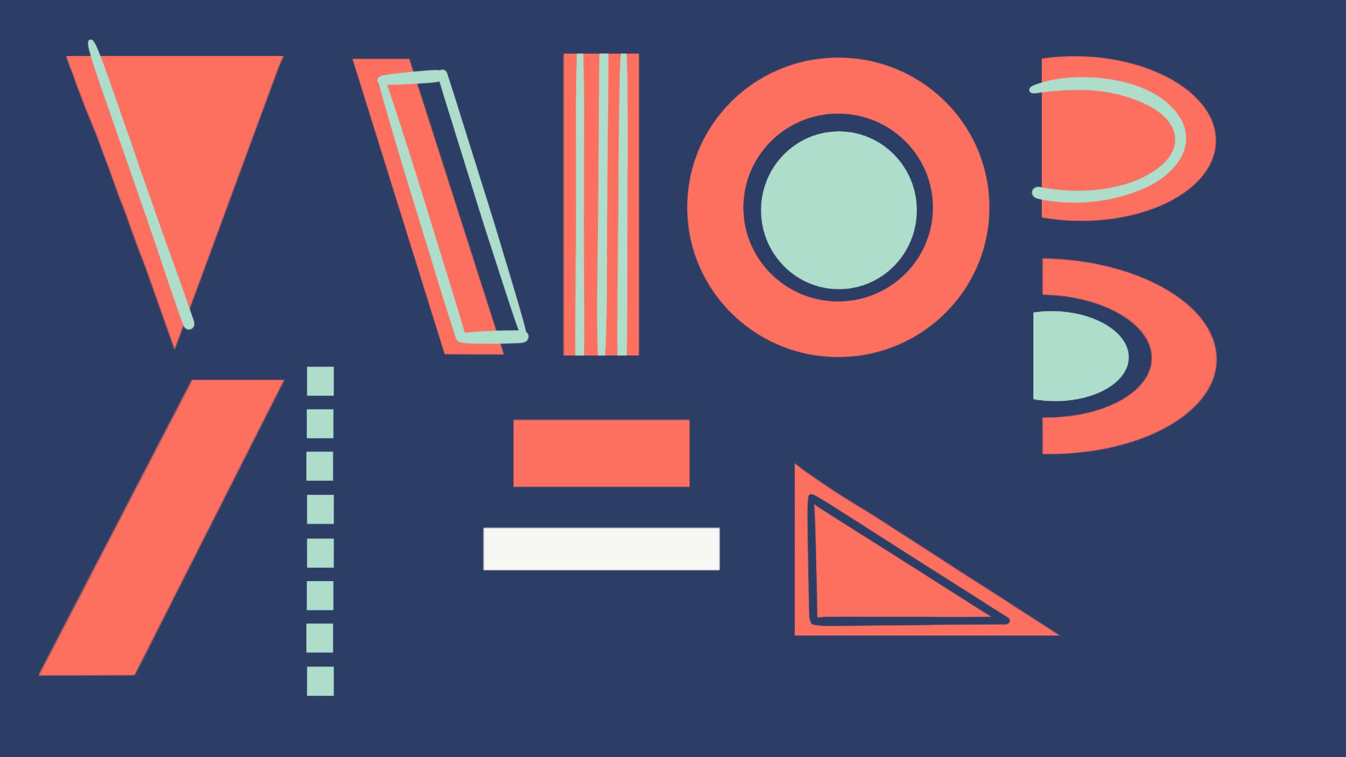
The shapes and themes got refined as I built them and animated my way through the alphabet, but they didn't diverge from the original concept too heavily. It was more a matter of being more considered in how I used color and the spot white. As I started animating I realized quickly that white strokes popped a lot more than the teal over the red shapes.


Lori Schkufza, Animator. The alphabet in use.